300 fields, four data sources, three browser tabs
An underwriter opens three browser tabs, types the same address into each, compares the results, then hand-enters the values into a 300-field form — for every building on every account. That was the workflow I inherited when I joined Blackboard Insurance as lead designer on Mission Slate.
By surfacing that data inline and giving operators a navigation model they could hold in their head, a full-day application became nearly two per day. On multi-location accounts, the gain widened with every additional building.
Problem
The bottleneck was manual data entry. Underwriters were copying the same address into three separate tools, comparing results, then typing values into the application by hand — for every building on every account. When something went wrong in a 300-field form, finding it meant scrolling through everything.
Before the redesign, a single-location application took most of a day. Multi-location accounts could stretch across two.
Solution
I redesigned navigation so underwriters could orient themselves and catch errors without hunting. Then I brought external data into the form itself so they never had to leave it.
Results
2× applications completed per underwriter per day
2.5× faster on multi-location accounts (and the gain grew with each additional building)
Product & Org
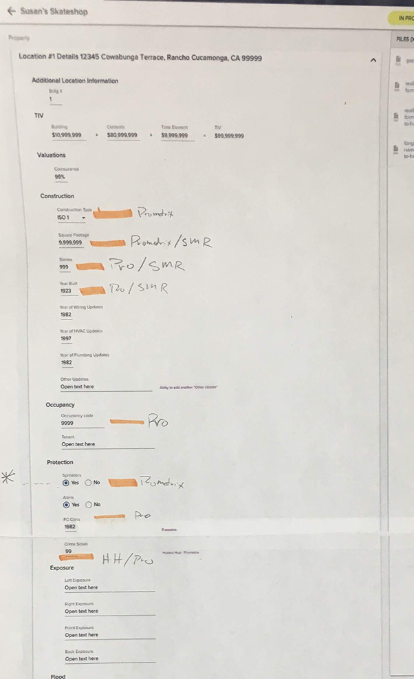
Blackboard Insurance was an AIG-incubated commercial insurer built on a simple premise: use data and automation to increase the speed and accuracy of underwriting. The product I worked on — Mission Slate — was an internal data entry tool used by junior underwriters to gather the information required to generate a commercial insurance quote. A typical quote involved 100–300 form fields pulling from up to four external data sources: property records, risk databases, and site surveys.
My Role & Goals
I was the lead designer on a small team — a PM, a tech lead, and an insurance SME (subject matter expert). I ran working sessions with the SME to map where external data actually existed across the form and which fields should never be auto-populated — and why. That domain knowledge shaped every interaction decision that followed.
The stated problems weren't the real ones
When I joined, the MVP had hit its ceiling — built to prove the concept, not to scale. As Blackboard expanded its insurance offerings, the instinct was to start "fixing screens." I pushed to do research first.
Interviews, observation, and engagement data surfaced two problems the team wasn't tracking:
- The MVP had no structural anchors — underwriters couldn't see what was left to complete or where errors lived.
- The real friction wasn't in the individual fields; it was in the constant context-switching between data sources and the form.
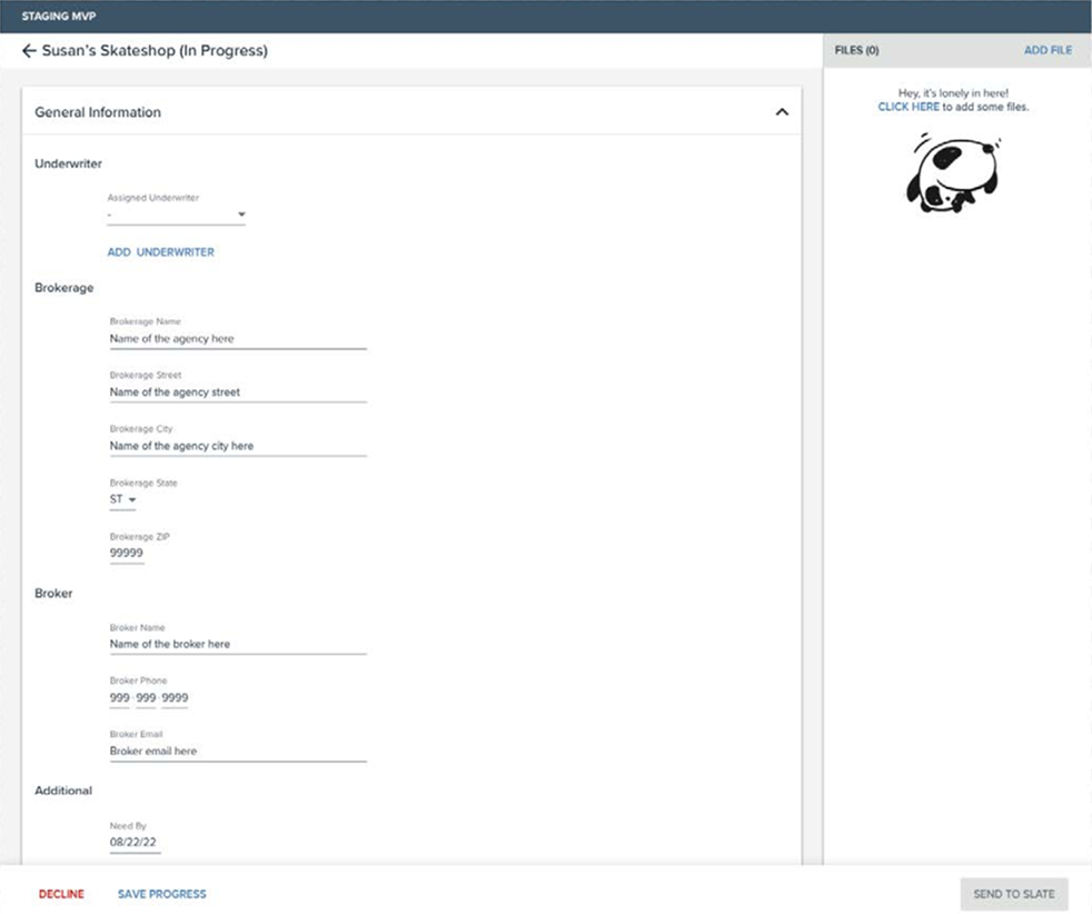
The MVP: no structural anchors, no way to know what was left or where errors lived.
No way to navigate a 100–300 field form
The form was a single long scroll with no structural anchors. Users couldn't see the full shape of the application before starting — or jump between sections without scrolling past everything in between. At this scale, that isn't a minor inconvenience. It's where errors hide.
Navigation that doubled as error radar
A persistent left nav mirroring the content hierarchy let underwriters orient themselves and jump between sections without losing context. In user testing, I first ran the form without it — it failed.
The nav also became the surface for validation errors, flagging exactly which sections needed attention without forcing users to scroll the entire form to find them — find the problem in one scan, not one scroll.
The redesign: full form structure visible at a glance, sections collapsible by insurance line.
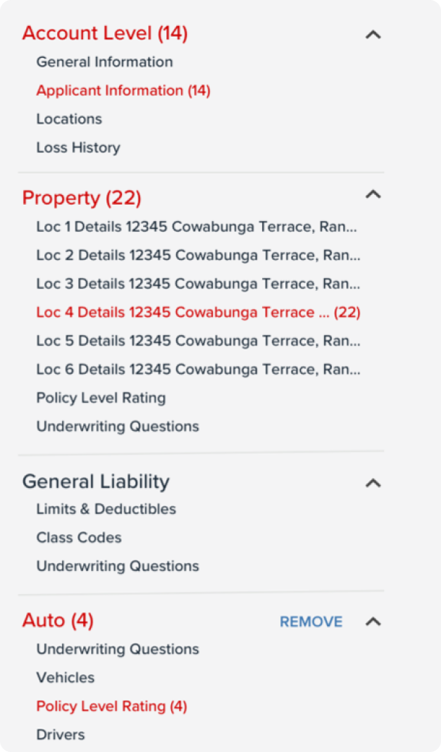
Validation errors surfaced in the nav — find the problem in one scan, not one scroll.
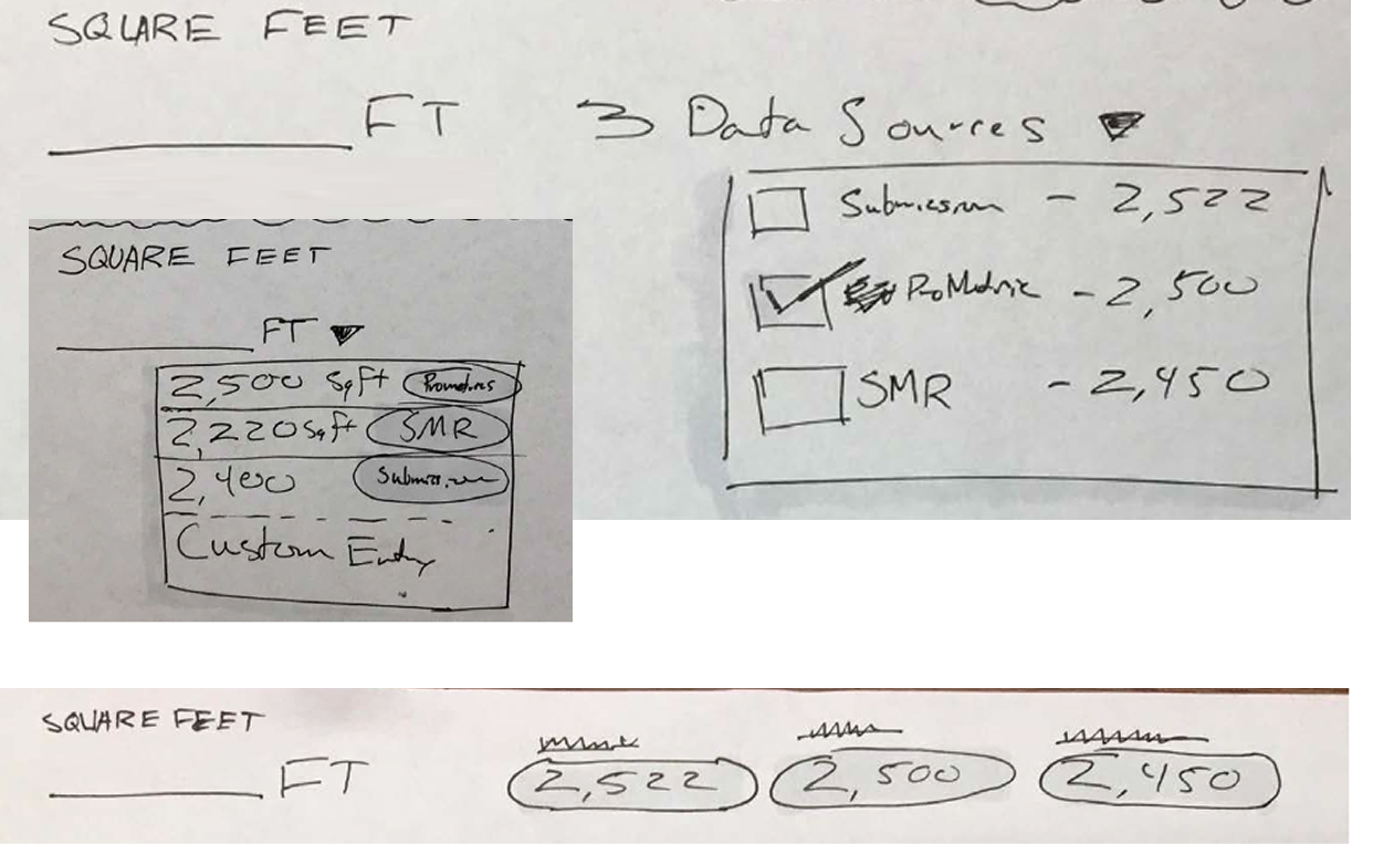
Copying external data was entirely manual
Operators pulled values from up to four external databases in separate browser tabs and entered them field by field. A single-location application was slow. A five-location application could consume an entire day.
From field-level fixes to a form-wide pattern
I started at the field level — sketching ways to surface a single external value next to a single input. A conversation with our SME reframed the scope: this wasn't one field's problem, it was a pattern repeated across hundreds of fields.
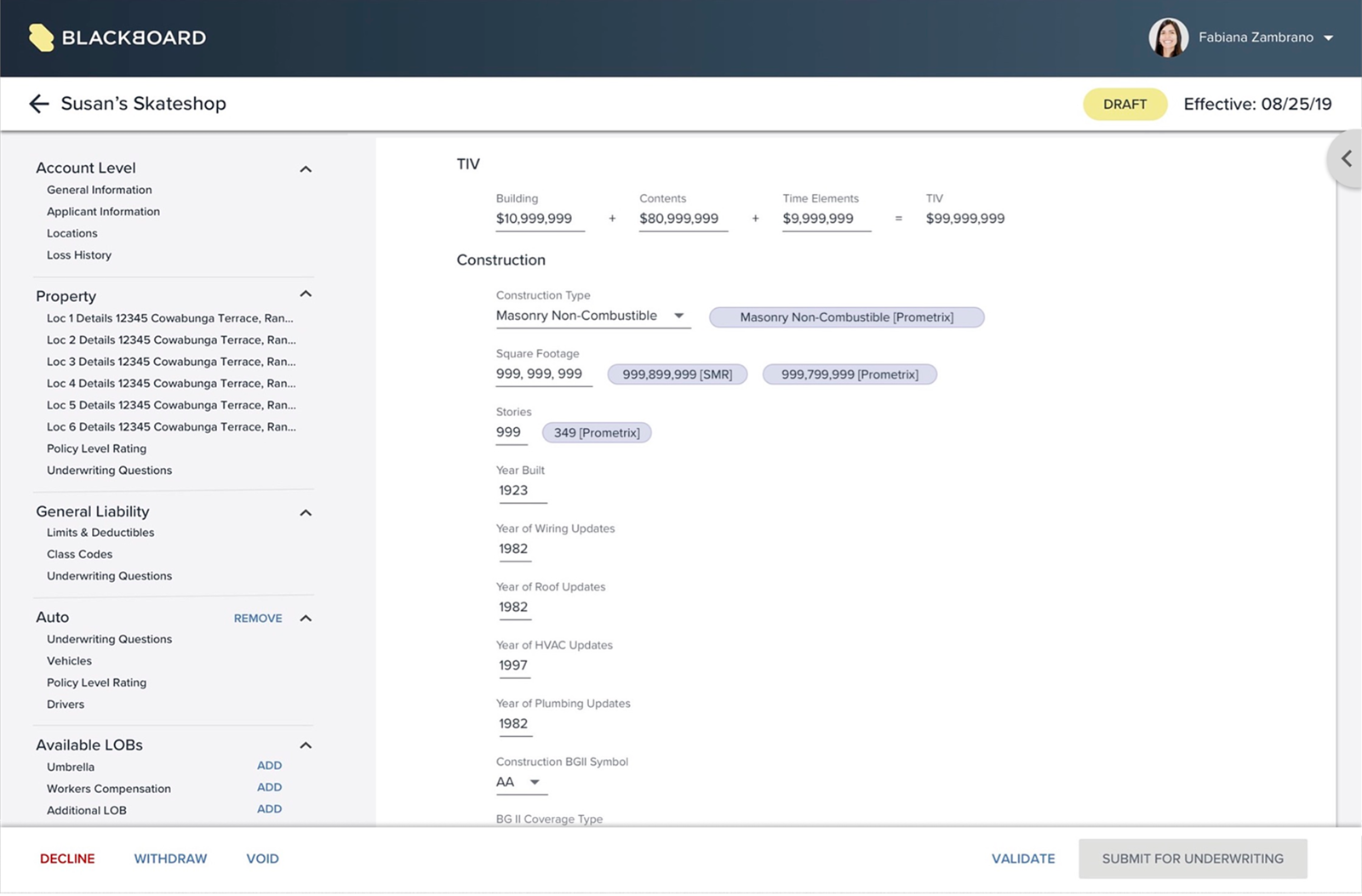
The chip pattern was the answer. Source values inline, typed correctly, one click to populate — and a clear path to manual entry when they didn't match. One interaction model for the entire form.
Early explorations at the field level — the right question, but the wrong altitude.
Mapping external data availability across the full form — the moment the problem changed altitude.
The chip pattern at scale — one click to populate when values matched, manual mapping when they didn't.
The field-level sketches weren't wasted — they were a fast, concrete way to start thinking. But the SME conversation that reframed the scope happened the same day. The real skill wasn't avoiding the wrong altitude; it was recognizing when a single conversation had changed the problem and being willing to throw out the morning's work.
The navigation work came first because it had to — the chip pattern would have landed in a form users couldn't orient themselves in. Sequence is a design decision.
Inheriting an MVP and scaling it up taught me that the most important question isn't "what's broken?" — it's "what does this product need to become?"